Life expectancy
What is it and how’s it looking?
Dec 20, 2024 | By: Kieran McConville
There’s something seductive about a simple metric or indicator that can help to neatly summarize a situation or set of circumstances. But the real world isn’t always that straightforward.
Data data everywhere
It seems like data has become the key to everything. The answer to all our problems. The new gold. In fact, it’s fair to assume that more effort and investment is going into data mining these days than mining for actual gold. Advances in quantum computing will soon supercharge our capacity to analyze and manage data at warp speed.
Having said all that, most of us like our data bite-sized and easily digestible. Putting a number on price inflation or maternal mortality or gross domestic product is a simple, palatable, and eminently shareable way of utilizing data. And there’s a plethora of cool ways to visualize it too. But of course, nothing in our world is as simple as we’d like it to be, and none of these headline figures can convey the complexities of the subject matter they so neatly summarize.

One of the most spectacular social advances of the past century has been in human longevity – that is the age to which most of us can expect to live. There’s no disputing that the average life expectancy figure today is significantly higher than it was a hundred years ago, for pretty much everyone everywhere. If I were looking for a conversation starter in the local pub or trying to shock my friends on TikTok, I could tell them that my 20-year-old son’s life expectancy is eight years longer than mine as a 56-year-old Irish man.
Open the World Bank website or the CIA’s online factbook and they’ll give you mesmerizing amounts of data for every country in the world, including a figure for life expectancy. You can marvel at the likes of New Zealand and Norway with their shiny 83, wonder why the US languishes at 77, and commiserate with the Cote d’Ivoire on its worrisome figure of 59. But we need to be careful with these numbers. Not only can they be misleading but, improperly used, they could be downright dangerous.
How and why
Life expectancy is often used as a measure of human and social development, or to assess the overall wellbeing of a nation or a cohort of people. It can be an indicator of the quality of available healthcare, access to proper nutrition, and the general living conditions of a population. In addition, it’s often used as a measure of economic development and social stability.

The United Nations says its figure for life expectancy at birth “indicates the number of years a newborn infant would live if prevailing patterns of mortality at the time of its birth were to stay the same throughout its life.” Of course, the chances of that happening are, at best, slim. Just look at all the wars, natural disasters, plagues, pandemics and other phenomena influencing mortality the world has experienced even in our own lifetimes, and you’ll realize the potential for inaccuracy. There are various ways to adjust the process for increased accuracy, but they are heinously complicated and not something we’re going to try to explain here (even if we could.)
The factors that can influence the life expectancy of any individual are many, including your gender at birth, where you live, what you do, your economic status, and even the genetic package you inherited from your parents. It’s a fact that women generally live longer than men and people living in low-income countries will have a shorter lifespan than those in high-income countries.
"Lies, damned lies, and statistics"
While life expectancy is a useful measure, it has its obvious limitations. For example, it doesn't reflect disparities within a population. Marginalized groups – the people Concern most often finds itself working amongst – are likely to have significantly lower life expectancies than the national average. Or to give a broader example, global life expectancy shot up from 50 in 1960 to 73 in 2019, an impressive increase of nearly 50%. But that figure is skewed by the advances in well-off countries… like Norway and New Zealand. Meanwhile, the Democratic Republic of the Congo (DRC) also saw a 50% increase, but the average projected lifespan of a child born there today is just 60.
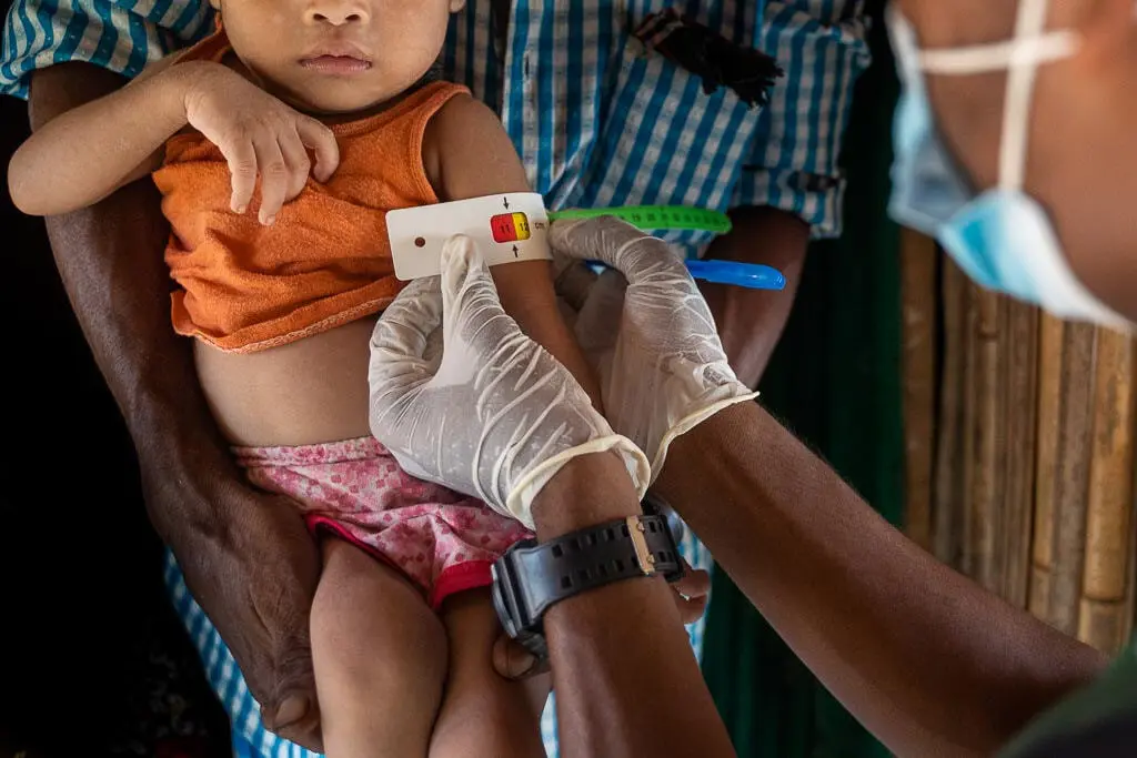
One of the ironies of the life expectancy metric is that it’s actually based on death rates, and that can lead to significant distortion. High infant mortality rates can drastically lower life expectancy figures for an entire population, which might not accurately represent the health of older age groups. Again, in many of the contexts in which Concern operates the mortality rate among children is heartbreakingly high. In Sierra Leone for example, one in ten children will not live to celebrate his or her 5th birthday.

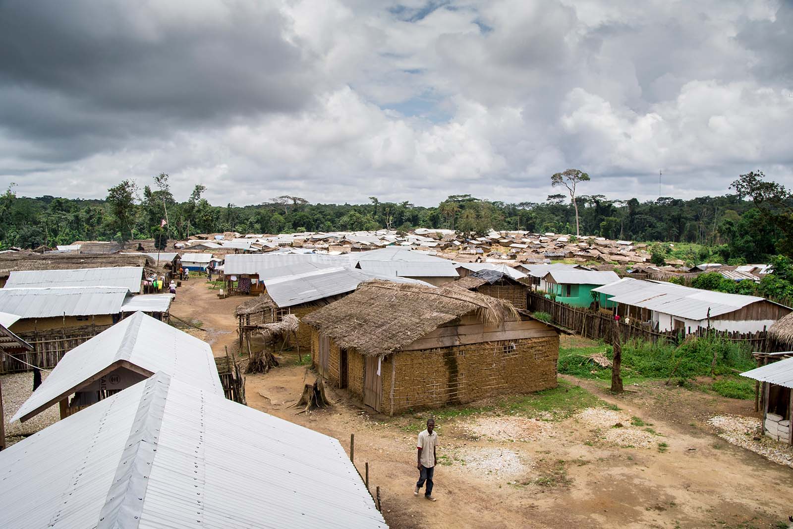
And then there’s the issue of quality. Firstly, the quality of the data available from which to extrapolate the life expectancy figure varies wildly, depending on the context. For years, Sierra Leone’s child mortality rate was more of a best guess than a fact-based figure. You can read here how Concern almost inadvertently played a role in securing reliable data for that country. Sourcing any kind of information in DRC is next to impossible, because it has no cohesive health system, is experiencing ongoing conflict and political strife, has very little communications or transport infrastructure, and is also simply enormous.
The other thing that numbers can’t properly assess is quality of life. Just because someone makes it into old age doesn’t mean they’ve had a chance to enjoy their time on this beautiful planet. It may just mean that they’ve been kept alive longer by a confluence of various factors but spent much of their time struggling to survive.
So, how’s it looking?
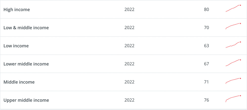
Having delivered all the above caveats, the life expectancy figures do deliver a useful snapshot, and the news is generally positive. Human beings, as a global cohort, live twice as long as they did a hundred and fifty years ago. COVID19 created a blip in the graph, but most countries seem to have bounced back, and the overall trend remains positive. Afghanistan, for all its challenges, has added 9 years to the average life expectancy of its citizens since the beginning of this century. Haiti’s progress has been slower, but it’s still progress. Ukraine has dropped by 3 years since 2019 – no need to guess why. Here’s a look at how things are going when you classify countries by income:
Mark Twain once wrote "Figures often beguile me, particularly when I have the arranging of them myself,” and it’s regularly the case that different people can interpret the same numbers in different ways, often to suit their own purposes. That is the way of the world, buyer beware.
Ultimately, life expectancy figures are just part of a broader toolkit of measurements available to those who work in the field of human development. They’re interesting to study and to track over periods of time, but we’re not going to get too hung up on the numbers. It may sound like a cliché, but at Concern our main interest is in the faces behind the figures.